


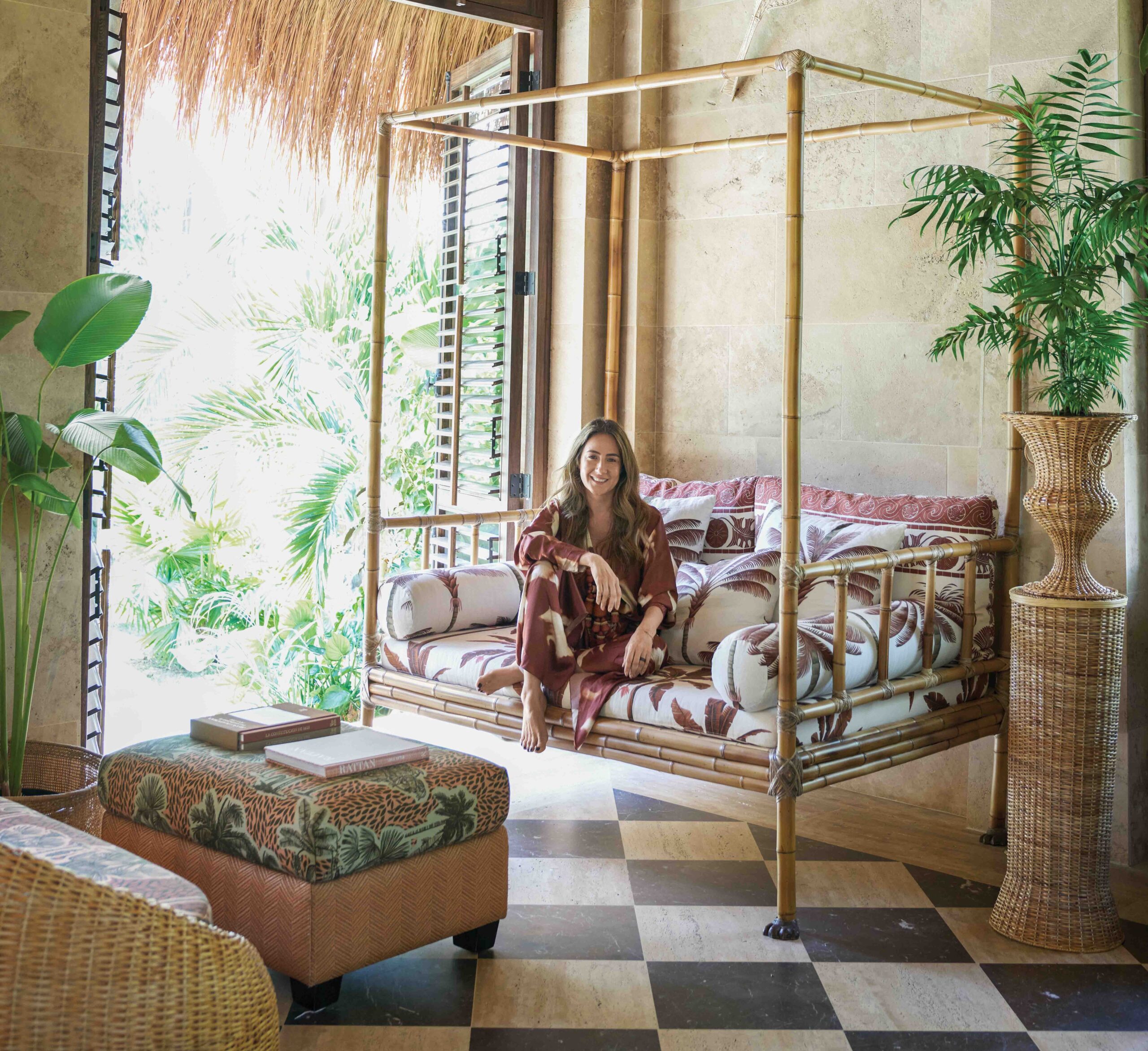


Whispery, barely-there hues are anything but a cop-out when deployed with skill. Quiet paint colors have enough depth and complexity to make even the most attention-grabbing combination gray with envy. One glance at these paint palettes and tricks, and you’ll want to live in a world of white, cream, and taupe.
ANALOGOUS HUES
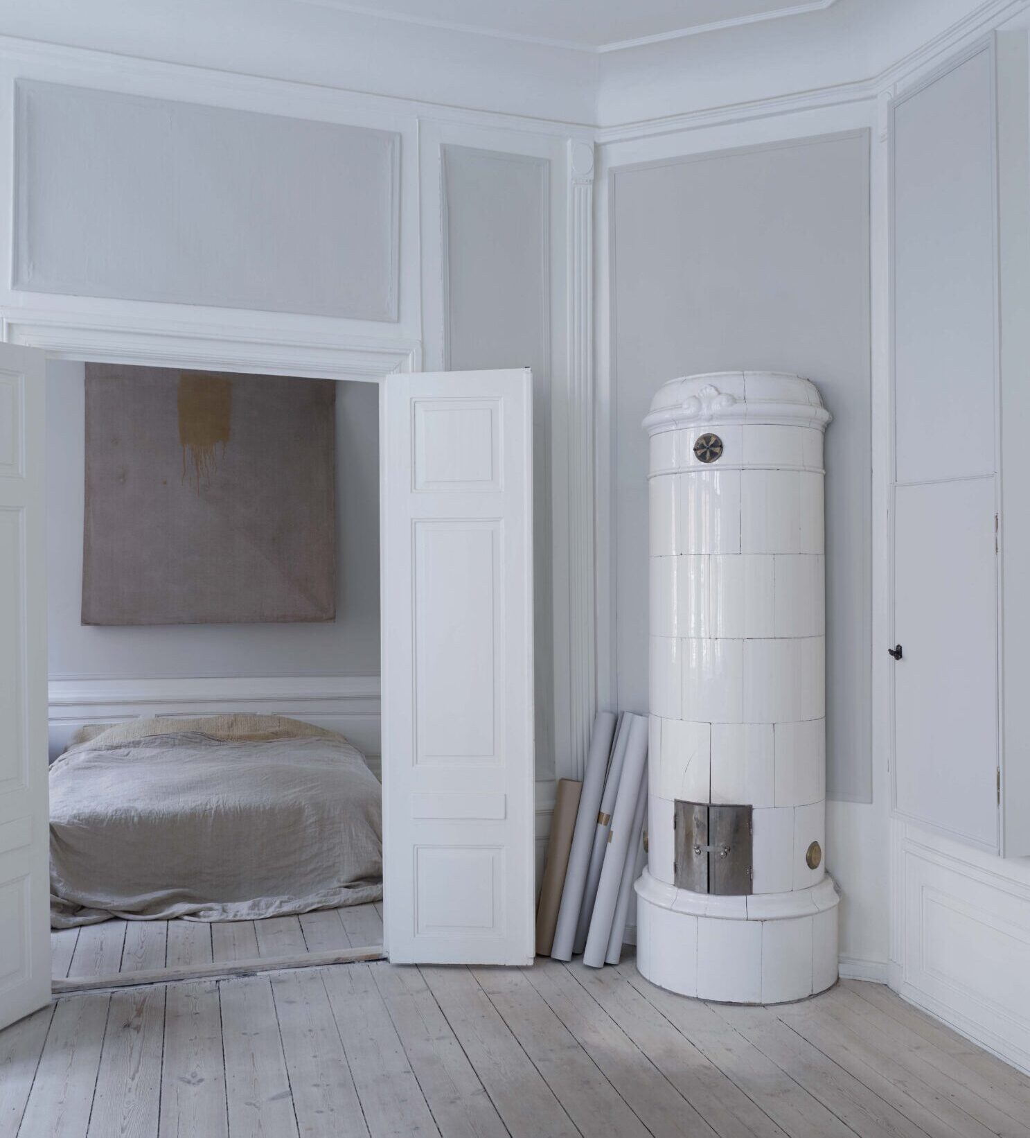
In his early-18th-century apartment in Copenhagen, Danish designer Oliver Gustav painted every surface pale gray, and then colored the original plaster panels in a slightly darker matte mineral paint to deepen the allure of the antique texture.

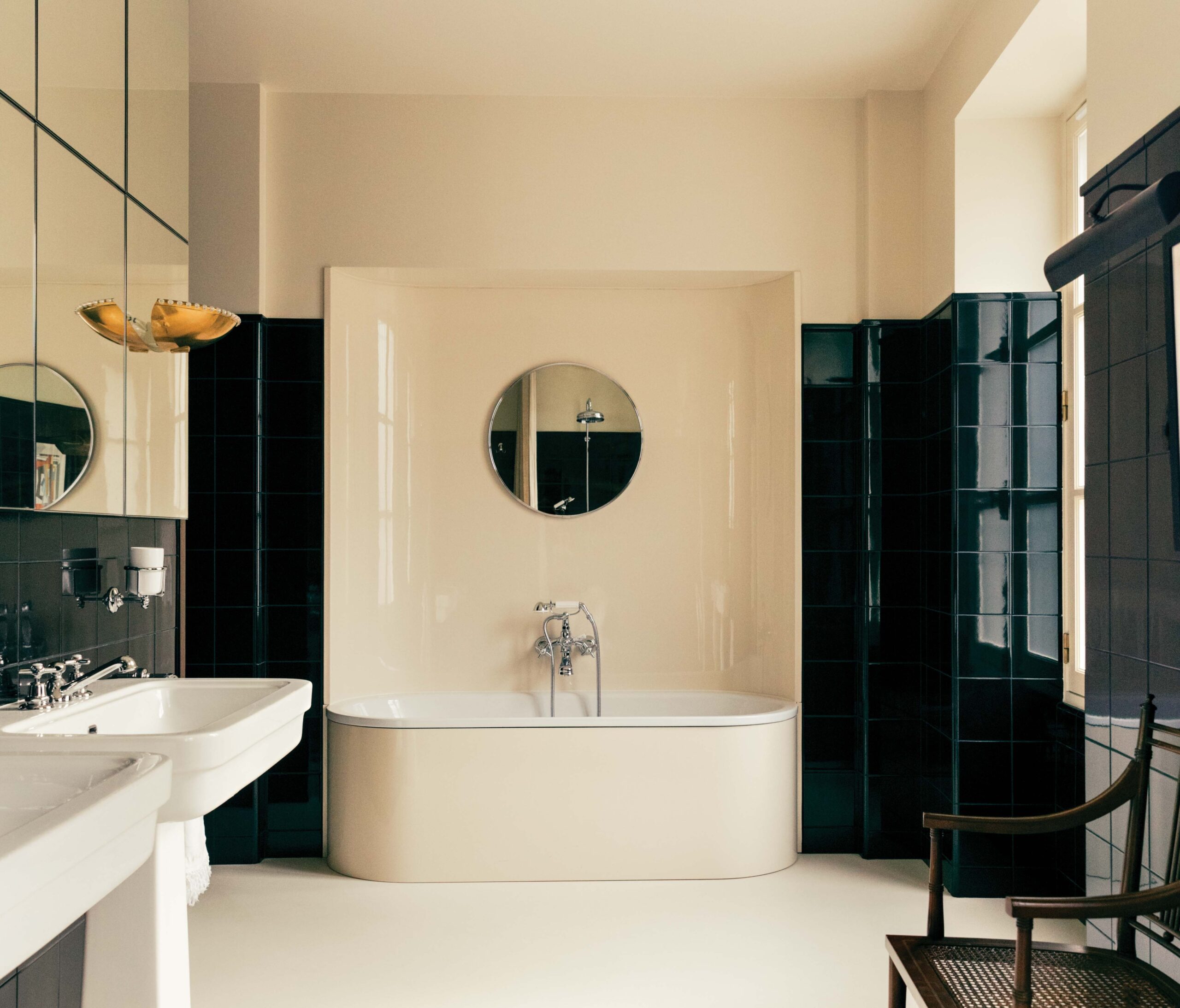
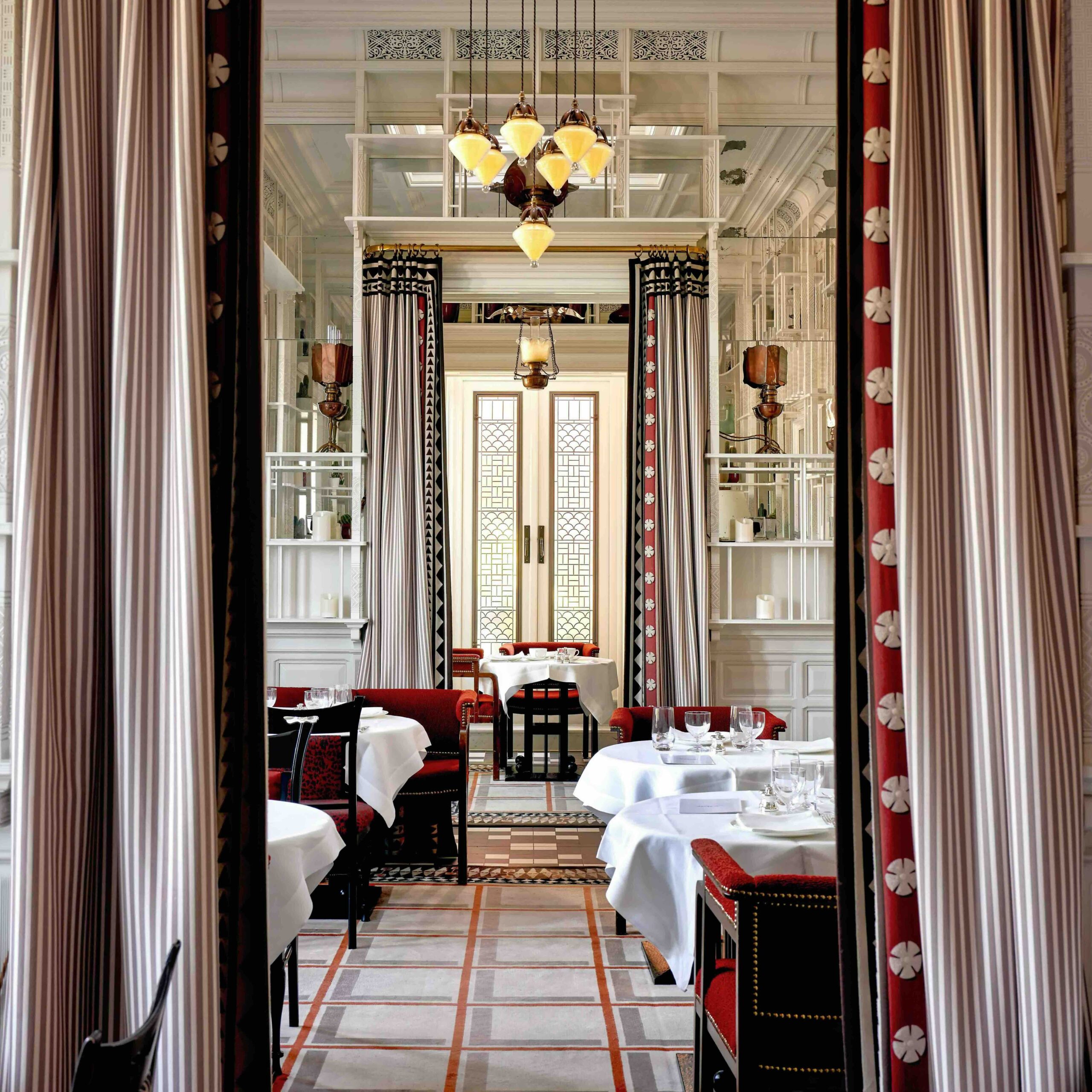
GLOSSED OVER
Without using a lick of color, decorator Alyssa Kapito created an incredibly elegant version of high contrast in this Upper West Side living room. The lacquered ceiling looks all the richer next to walls brushed with a flat finish in the same crisp white shade.
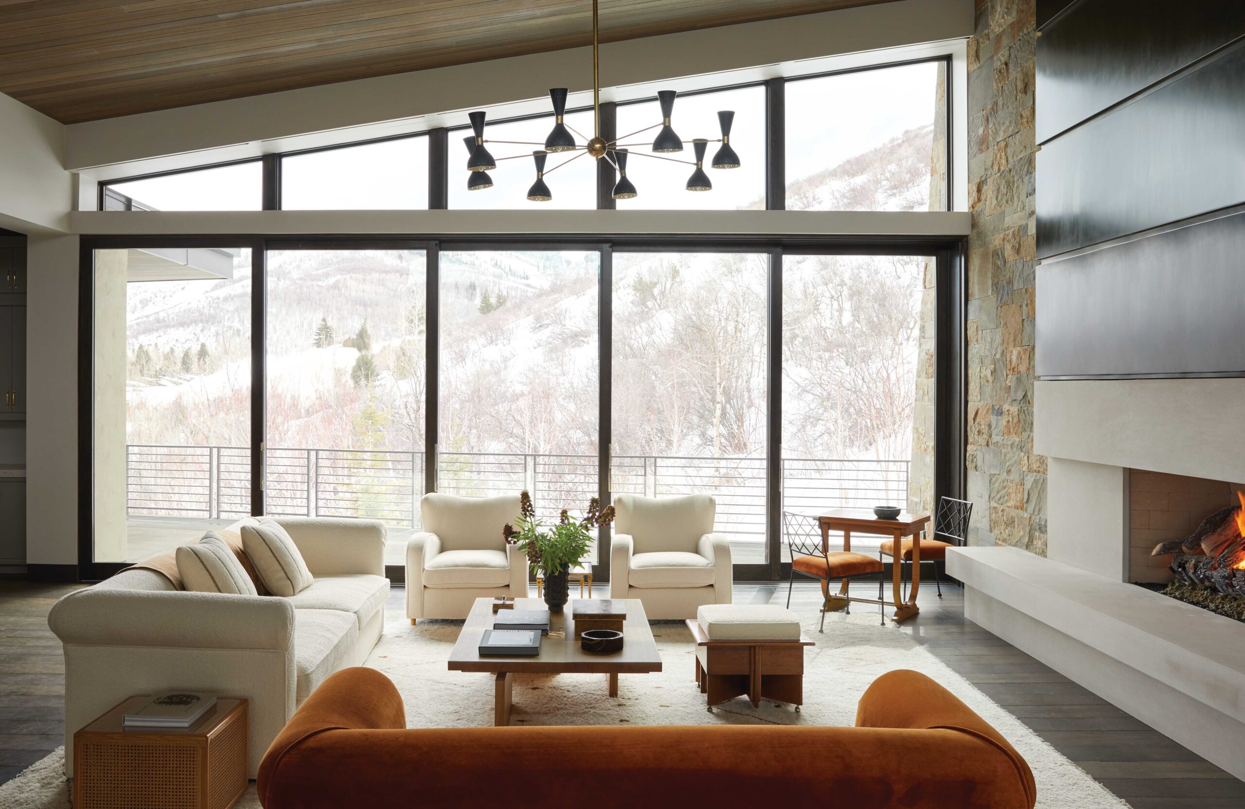
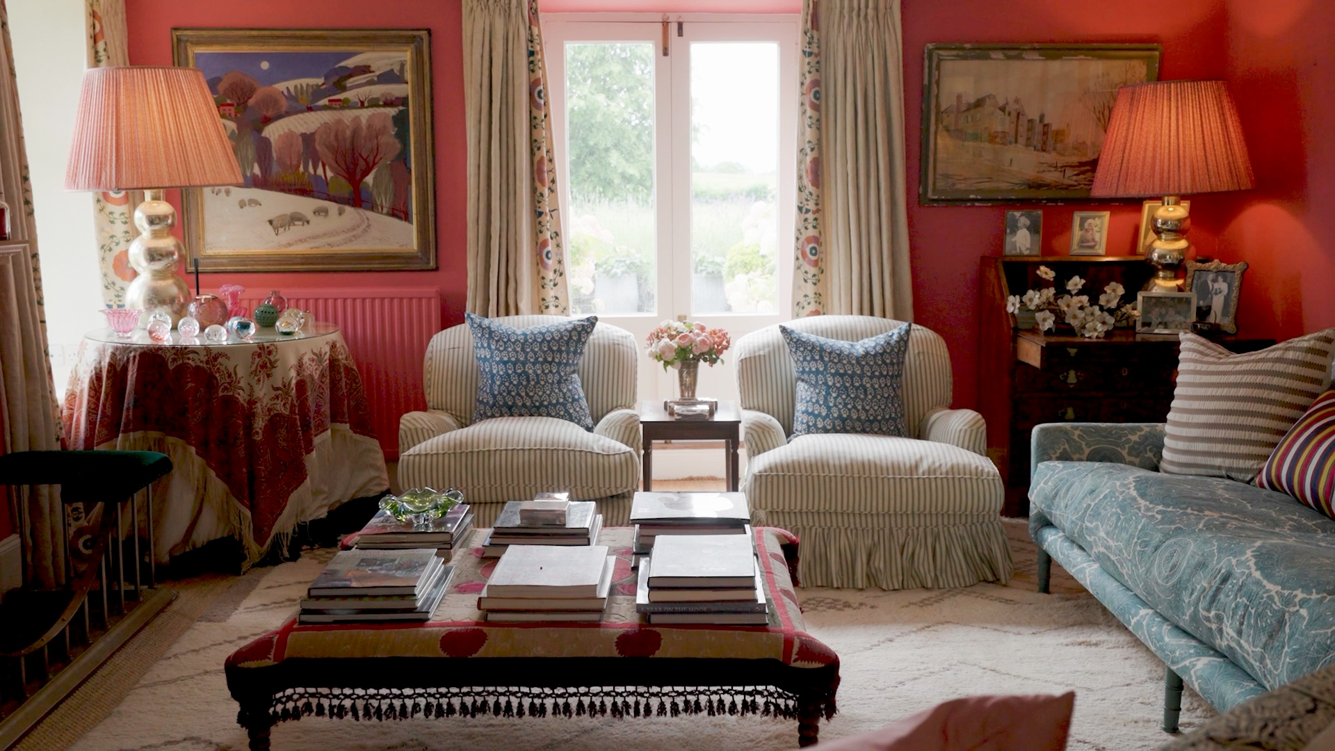
SOTTO VOCE
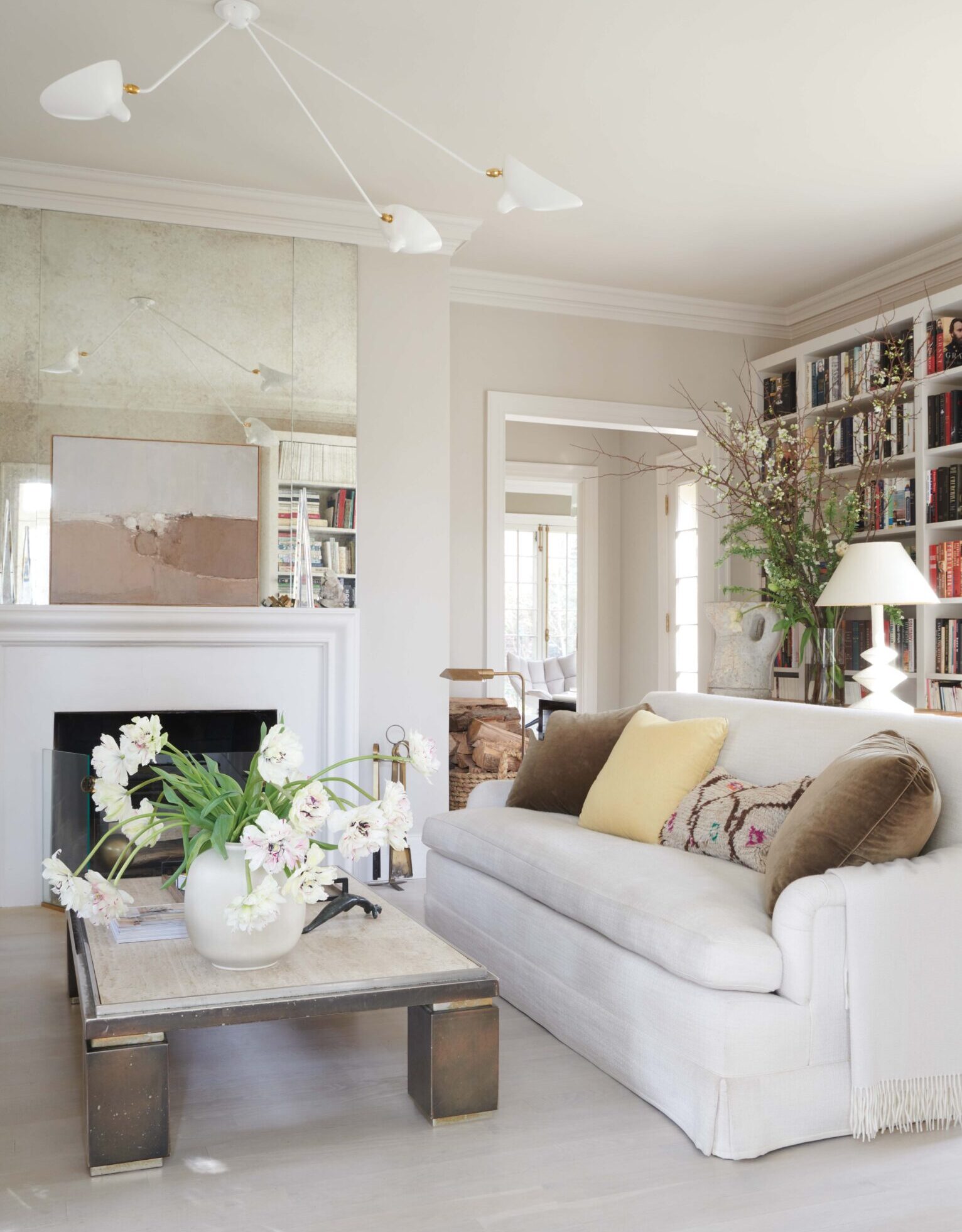
For a flies-under-the-radar sense of sophistication, FREDERIC editor-in-chief Dara Caponigro called upon neutrals to play the starring role in the living room of her 1920s Georgian home in New York. The whisper of difference between walls, ceiling, millwork, and whitewashed floors creates a profound sense of calm and comfort.

LANDSCAPE PAINTING
In this Swedish summer house kitchen, London-based Studioilse managed to make a multihued palette of sand, shell, and cloud feel as soothing as the natural world outside.
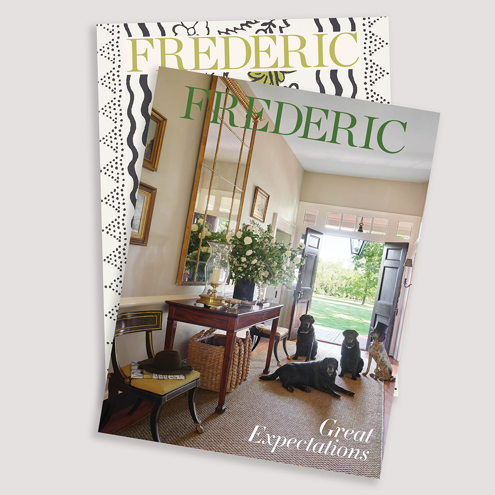
THIS ARTICLE ORIGINALLY APPEARED IN VOLUME 12 OF FREDERIC MAGAZINE. CLICK HERE TO SUBSCRIBE!