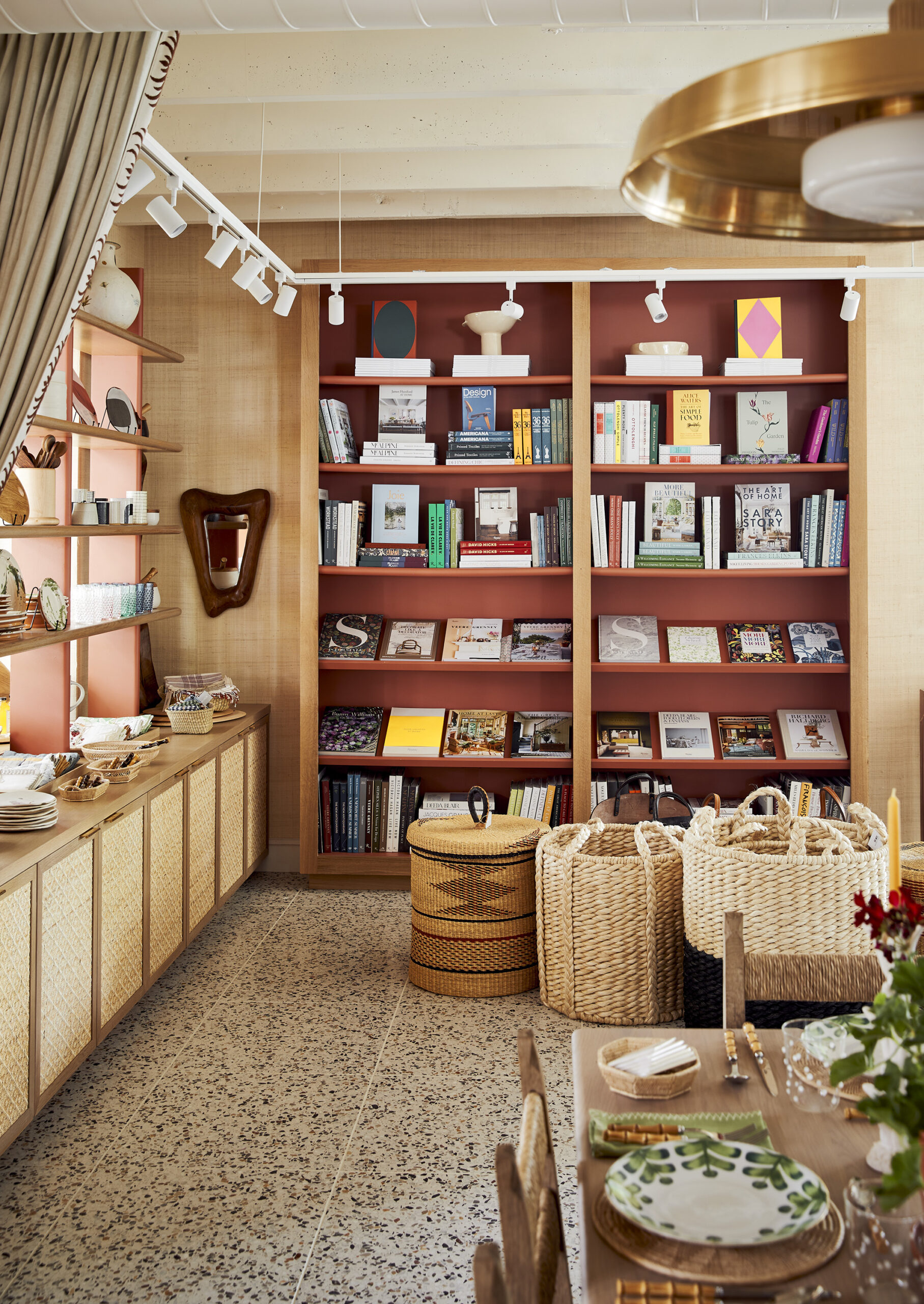
When you step inside Brittany Bromley’s offices, you may wonder if you’re in her home. And that’s exactly what the interior designer had in mind when she conceptualized the design studio and retail space she shares with her husband, landscape designer Matthew Bromley. Facing the green in charming Bedford, New York, Brittany Bromley Interiors at The Jackson House gives a nod to the home’s original owner, George Jackson, who built it in 1857. Later, it served as a residence and depot for the town’s stagecoach driver. “We wanted it to feel like a home so clients would see what we could do for them as soon as they walked in,” says Bromley. “That’s why we incorporated the word ‘house’ into the name.”

The couple—who often collaborate on residential projects—did a top-to-bottom renovation of the property in 2016 that included their offices, a sample room, and retail space. Every one-of-a-kind piece in the shop is for sale. “In isolation, it can be difficult to imagine how you’d use something, whether it be fabric, furniture, or an objet. But when they’re done together in a room designed with that in mind, they become much easier for clients to visualize in their own homes.”
Here, the designer shares the strategies she enlisted to create a space that not only combines form with function and retail space with offices, but that also reflects and inspires her work.

Offices Needn’t Be Austere
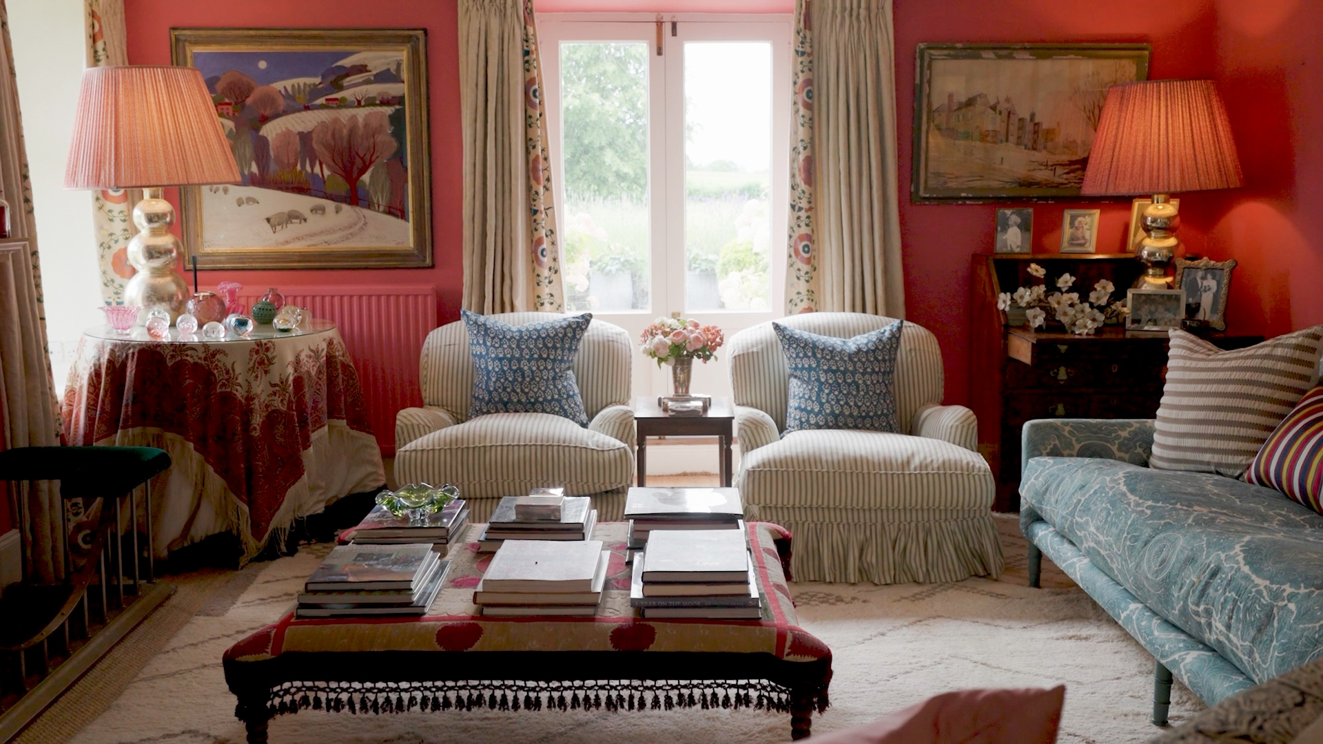
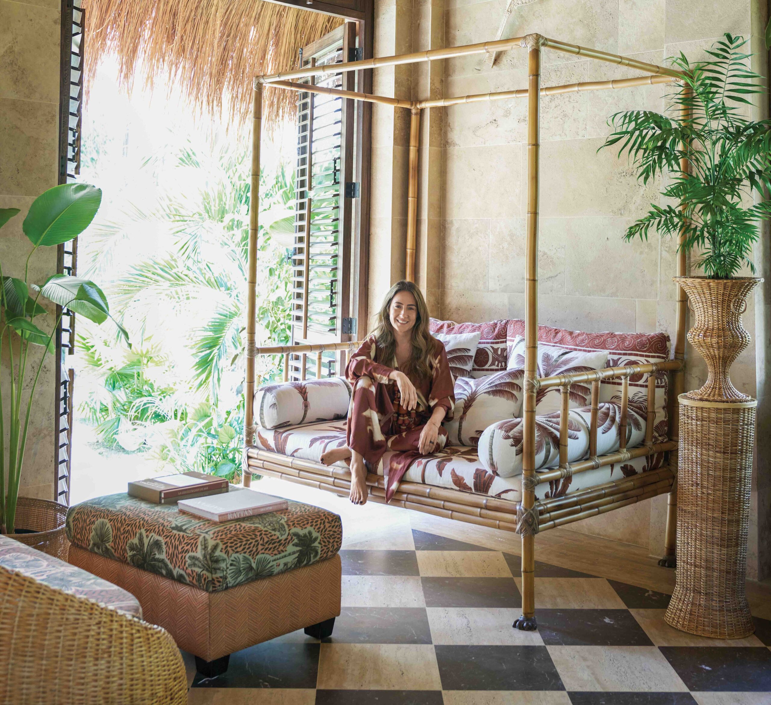
Some creatives require a minimal, blank workspace. Not Bromley, who jokes that “austere” isn’t in her vocabulary. “I personally gravitate towards, and function best in, spaces that are really collected, curated, and warm.” Inspired by her love of Schumacher’s Lotus Garden in Jade, she centered the entire design of her office around it and splashed out on other boldly-patterned wall treatments, rugs, and cushion fabrics. Just before the pandemic hit, Brittany recovered two armchairs by her fireplace in another striking print: Jokhang Tiger Velvet. “Those chairs gave me an enormous amount of joy in the really dark days of early spring.”


Start in Neutral
Bromley created timeless, neutral bases for both offices with wall-to-wall sisal carpets and neutral wallcoverings like the pale Jinan Arrowroot grasscloth in Matthew’s workspace. His color scheme was a direct reaction to the attention-grabbing pinks, reds, and greens of Brittany’s office. For him, she picked more masculine and subdued shades of brown. They’re punctuated by ebony and gold like the pair of gilded koi lamps she calls the most gorgeous in the world: “He’s only borrowing them until I can figure out where else I can put them, so I see them more often.”
Layered Looks
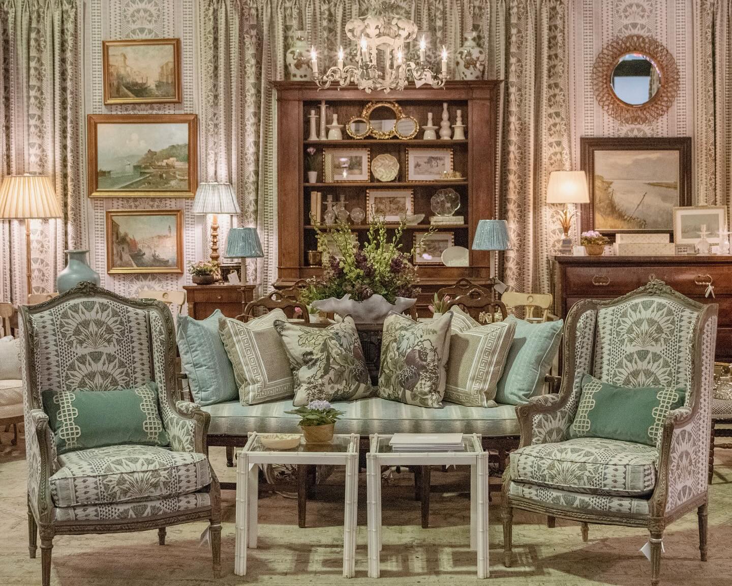
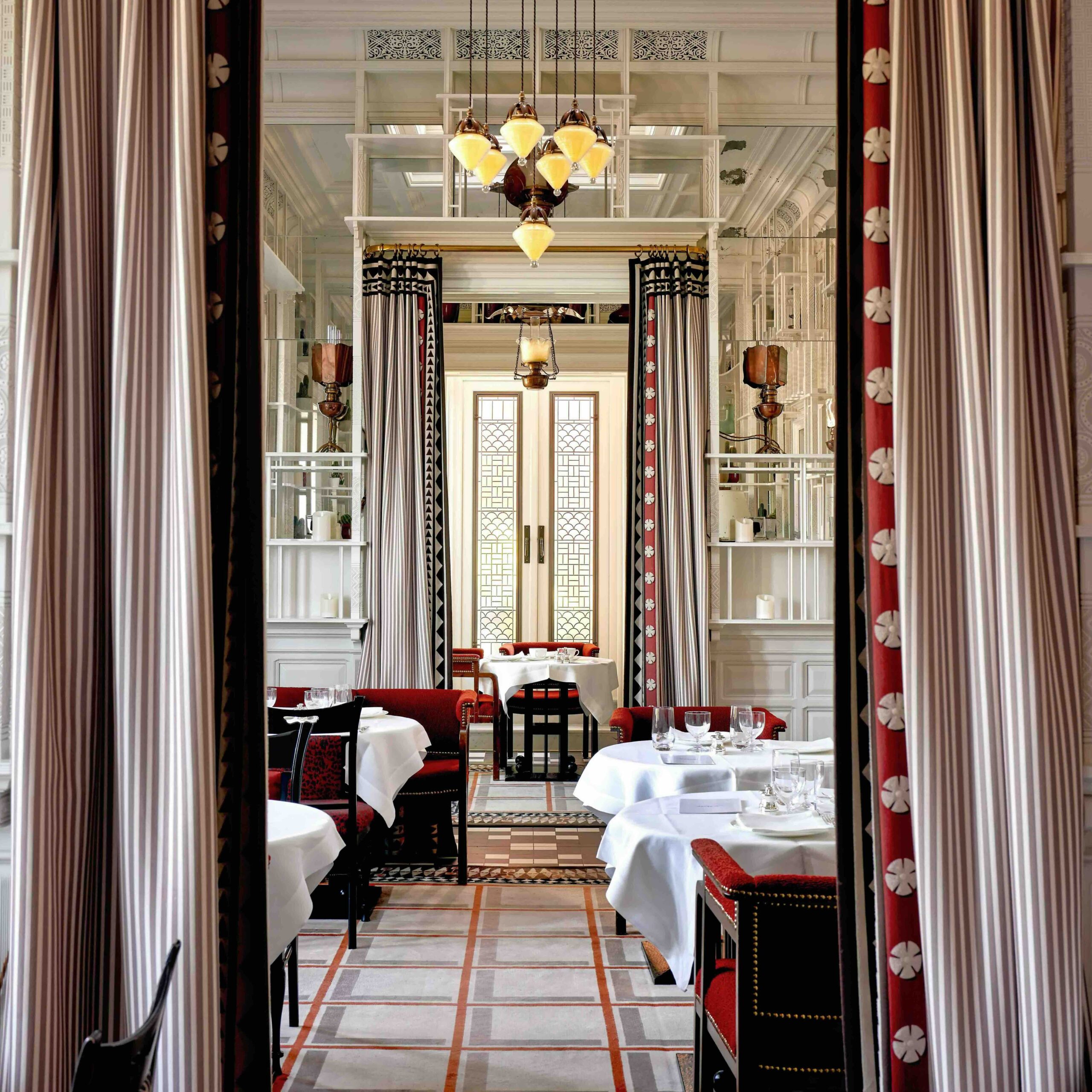
Brittany gave two areas on the retail floor where she meets clients neutral rugs and upholstery in subdued linens, checks, stripes, and toile — fabrics that layer and play nicely with others. From there, she accented the rooms with more eye-catching patterns like a green velvet leopard print, a charming floral, and curtains trimmed with a Greek key-inspired tape.

Period Play
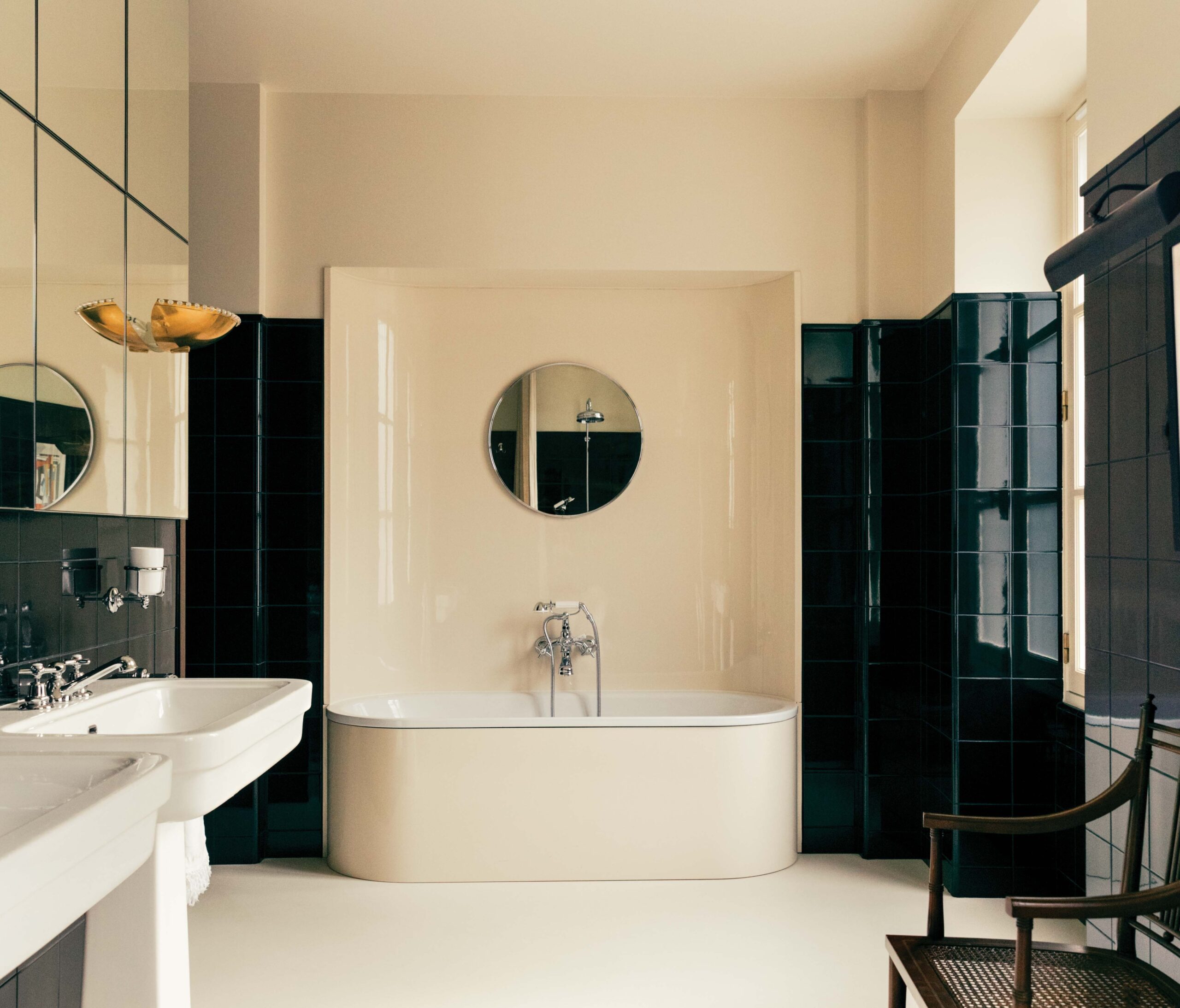
Bromley likes to give her designs a sense of playfulness by mixing elements from different periods. To keep the bathroom in her 19th-century offices from feeling stuffy, she introduced Schumacher‘s Queen of Spain wallcovering in Warm Silver. The pattern, which was first introduced in 1963, still feels fresh today. “It was important to us that the historic bathrooms had a sense of history, yet were still quirky and fun, and this wallpaper that we absolutely adore did the trick. We mixed it with a marble mosaic for the floor, and the results are smashing!”

Streamlined Storage
The sample room is organized by a wraparound grid of shelving units and bins that corral fabrics, carpets, wood, ceramic, and hardware. Everything fits into “forgiving” storage cubes labeled with white paint pens. On top, baskets keep samples for individual clients handy, so Bromley can see all the elements together at a glance.
But Bromley admits the organizing process involved some trial-and-error. She laughs recalling the single bin labeled “neutrals” when she first started out. She and her team stacked fabrics in open shelving until she realized that “Everyone has a different idea of what ‘neatly folded’ means,” so now everything gets tucked out of sight in bins.
The “Fifth Wall”
Due to its slanted roof, an awkward alcove that’s not original to the house presented a design challenge. “So we could make the most of the roof and make it feel as though it were a design element as opposed to an afterthought, we added wallpaper on the walls and ceiling.” The marbleized blue wallcovering reminiscent of Van Gogh’s Starry Night makes the alcove feel less jarring, and more like a thoughtful and cozy space that’s used as a sample room. It turns the ceiling into a decorative “fifth wall.”

Curtain Call
Although the storage system usually keeps samples tidy, there are still days when it devolves into what Bromley calls “messily-creative, versus neatly-creative.” So to give herself the option of closing the room off to the general public, she installed a curtain and valance in white cotton waffle piqué. It’s an instant “now you see it, now you don’t” disappearing act that every designer would benefit from having in their bag of tricks.
PRODUCED AND STYLED BY CAROLYN ENGLEFIELD
PHOTOGRAPHY BY KEVIN KERR
